


Nominal News is an economics newsletter written by a PhD Economist that translates the latest economic research into clear, policy‑relevant insights on current issues. Join 4,000 readers to stay-up-to-date with Nominal News directly in your inbox:
Hello,
Today, as the last part of the Nominal News re-launch, I am debuting a Paid Subscription Tier, in addition to the current Free Tier. I want to give you an update of what to expect, and explain what will be provided in the Paid Tier.

Paid Tier
The Paid Tier Subscription will, in addition to the weekly deep dives that are part of the Free Tier, provide the following:
Special edition articles ~twice a month, covering breaking economic developments, as they occur;
Audio coverage of certain deep dive articles to give further information and opinion on the topic covered;
Early access to my own data analyses;
Prioritizing responses to any questions about the weekly deep dives.
Special Edition Articles
In these articles, I will focus on applying academic economic research to breaking developments, as well as provide more of my opinion on the subject.
As an example of the type of article, over the last few weeks, I have provided 4 Special Edition Articles:
As you can see above, the topics covered were interest rate announcement meetings, tariff arguments and the most recent US policy of expanded bond buybacks.
I will publish around 2 Special Edition articles per month for Paid Tier subscribers and, as relevant for major economic developments. The next one, for example, will cover the FOMC Meeting on interest rates on September 16.
Pricing
The paid Tier Subscription will cost $100 for a yearly subscription. But, as part of a launch promotion, I am offering a 40% discount – so $60 for the first year (which works out to be $5 a month). This new subscriber offer will only last through September 18.
I will also offer a monthly version of the Paid Tier that will cost $30 (discounted to $18 per month for the whole year, as part of the launch through September 18), in case you’d like to try it out first.
The reason why the stand-alone monthly subscription is higher than the annual is two-fold:
I believe the most value will be derived from being a subscriber for a year, as articles will connect thematically with each other, and;
By having longer-term subscribers, I will be able to focus my writing on topics that I deem important rather than focusing on topics that will retain short-term subscribers and get clicks.
Lastly, if you’d really like to champion my mission of sharing economic knowledge and insights with the wider community, please consider becoming a Founding Member at $1,000 per year. Your support will help accelerate Nominal News and allow me to enhance the offering, of which you will be the first to know! You will receive a personalized Nominal News stein mug as well.
Free Tier
Under the Free Tier, you will continue to receive weekly emails that will mostly focus on deeper dives into economics research and policy. There will be no change here and you will continue to receive weekly emails – most likely on Mondays. As one of my goals with Nominal News is to share my economics knowledge with the wider public, I would not want to paywall this.
I am already very grateful for your subscription, and if you’d like to support me in other ways – likes, comments and sharing the articles are always extremely helpful! Actually, I have enabled the Substack reward program, which will grant you a reward for referrals here:
5 referrals – 1 month Paid Subscription
20 referrals – 1 year Paid Subscription
50 referrals – a Nominal News themed stein mug (I use it for tea and beer!)

Thank You
As always, thank you very much for supporting my work and my mission. I would not be able to launch all this without your support! I am very grateful and excited to continue the Nominal News journey with you!
If you have any questions/comments, please do not hesitate to reach out on substack or via email, nominalnews at gmail.com
Now onto a quick topic:
II. Inflation Measures By Income Groups
Inspired by a piece written by Substack Writer Michelle Teheux on poverty lines and how a single measure fails to capture how people experience poverty, I went ahead and did my own analysis on how inflation impacts people in different income brackets.
It should not be surprising that a much richer person might have a different consumption basket than a person living at the poverty line. One could assume that a higher income person will more likely spend a higher share on various services, while a lower income individual might spend more on necessities such as food, rent and energy.
As an exercise, I would like to ask you to think about how a consumption basket between a top 5% income individual and bottom 20% individual might differ, and who experienced higher inflation in the last 12 months (and by how much).
Consumption Basket Differences
To understand the spending patterns by different income groups, I relied on the work of Zheli He, Xiaoyue Sun and Efraim Berkovich of the Penn Wharton Budget Model. From their analysis:
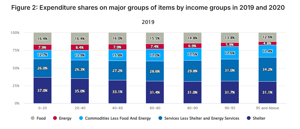
Lower income individuals (left most column) do spend a lot more on food, shelter and energy. The lowest income group spends around 61% of their income on these items, while the highest income group (right most column) spends only 48%.
Measuring Inflation
Since each income group has slightly different spending baskets, it should not be surprising that each group may experience inflation a bit differently. For example, if food inflation is higher, then lower income groups experience higher inflation.
To analyze this, I used the above the spending percentages1, and applied the actual recent inflation in each of the spending categories from the Bureau of Labor Statistics.2
Based on the spending patterns of each of the income group, I approximated the inflation rates faced by the lowest income group and highest income group over the last 12 months:

The inflation rate faced by high income individuals lately has been much lower than the officially stated rate. Moreover the gap itself is quite significant – almost a 0.6 percentage point difference in inflation rates.
Rethinking Real Wage Growth
The above analysis also points to a slightly different perspective on how much real wages grew for every household. The Federal Reserve of Atlanta’s Wage Growth Tracker shows that as of July 2026, the lowest income quartiles saw a 3.7% growth in wages, while the highest income quartile saw a 3.8% growth in income. With the above inflation measures, that means the lowest income households saw nearly no real wage growth in the last year, while the highest income households witnessed a 0.8% real wage growth.
This suggests that many in the lower quartile of income have seen their incomes stagnate over the last year. The adjustment for inflation by income could also adjust our view of what real wage growth workers saw since the pandemic. Post pandemic, low income households saw some of the strongest wage growth. However, it might have been muted by particularly strong inflation in categories they spend. This is something I’ll look into.
If you would like to support us in reaching our subscriber goal of 7,000 subscribers, please consider sharing this article and pressing the like❤️ button at top or bottom of this article!
Optimally, I would recompute the 2019 Zheli et. al consumption basket for more current data.
The ‘Services’ index, I had to create myself.
Great example of why much of our mass media financial information is flawed and too simplified. Statements about inflation, unemployment, wages, etc that are aggregated across the entire population tell us very little about what individuals in a variety of circumstances are experiencing.