
Housing and Affordability – No Easy Solutions
A new paper on housing supply constraints suggests they do not matter for affordability.

Thank you for reading our work! Nominal News is an email newsletter read by over 4,000 readers that focuses on the application of economic research on current issues. Subscribe for free to stay-up-to-date with Nominal News directly in your inbox:
If you would like to support us in reaching our subscriber goal of 10,000 subscribers, please consider sharing this article and pressing the like❤️ button at top or bottom of this article!
Solving the problem of housing affordability is one of the top social issues. One often-touted solution is removing various supply constraints on housing such as zoning and building regulations. Theoretically, it sounds like such a policy change should lead to a fall in house prices and rents. But recent research by Louie, Mondragon and Wieland (2025) (“LMW”) suggests otherwise.

Supply Constraints
LMW set out to answer the following question – can housing supply constraints, such as zoning laws and other regulations, explain the observed house price and house quantity differences between cities (more specifically, metropolitan statistical areas) in the US. It is commonly believed that the reason certain cities are ‘more expensive’ is that it is much harder for new housing to be built in them due to onerous regulations.
To test this hypothesis, LMW decided to look at how housing supply in a city reacts to changes in housing demand. If something causes housing demand in an area to go up (for example, new job opportunities), we can look at how the quantity and price of housing change in response to this ‘demand shock’. In cities where it is ‘easier’ to build, housing quantities should go up by more and prices should not rise as much as in cities where it is ‘harder’ to build. Visually, this would look like this:
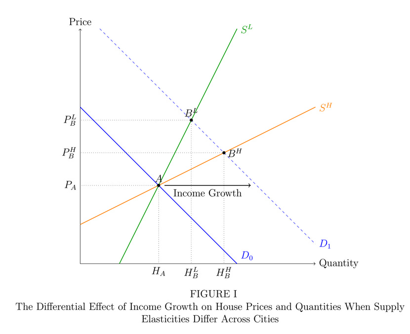
Here we can see the standard supply-demand graph – with price on the y axis and quantity on the x axis. If something such as income growth or better jobs causes a shift in demand (from line D-0 to line D-1), in ‘easy’ to build cities (denoted as orange S-H), we’d be at point B-H (from point A). In ‘difficult’ to build cities (green S-L), we’d be at B-L.
Looking at these shocks to housing demand, we can figure out what the slope of the supply curve looks like – the flatter it is, the more elastic housing supply is; meaning that, for a small change in price, significant new construction will occur (orange S-H line). Cities with greater supply constraints should therefore show larger price growth with smaller quantity growth as compared to cities with lower supply constraints.
Measuring Supply Constraints
Multiple economists have developed measures of supply constraints that include factors such as regulations and geography. Below is a graph that shows the correlation between house prices and the four different measures of supply constraints (referred to as the elasticity of housing supply in the graph):
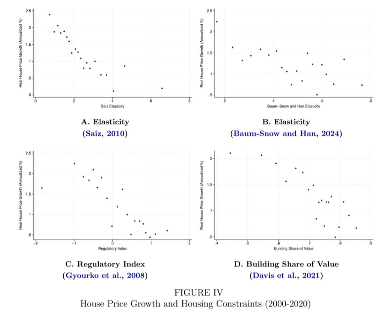
As can be seen in the above graphs, regardless of which of the four measures we use, as housing supply becomes more elastic (x-axis), i.e. it is ‘easier’ to build, house price growth falls (y-axis). But what happens to quantities?
Do Supply Constraints Matter?
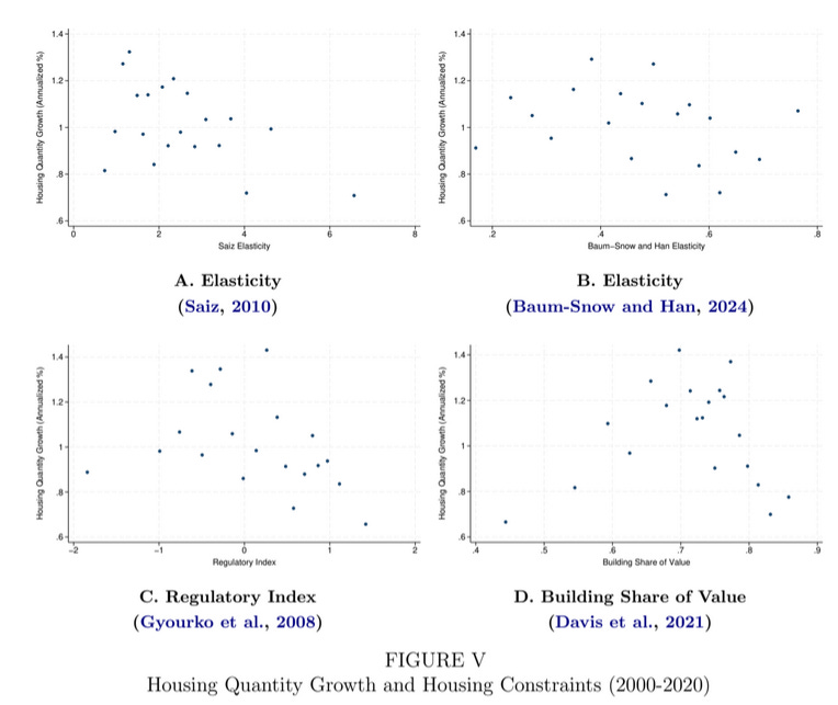
This chart shows the same four elasticities as in the previous chart, but on the y-axis, we have house quantity change. As can be seen, there does not appear to be any pattern – especially not in the expected direction – that cities with higher supply elasticities have more housing (a positive relationship).
Combining house price growth and house quantity growth, in the chart below, we can see that areas that had most housing quantity growth also saw the highest price growth:
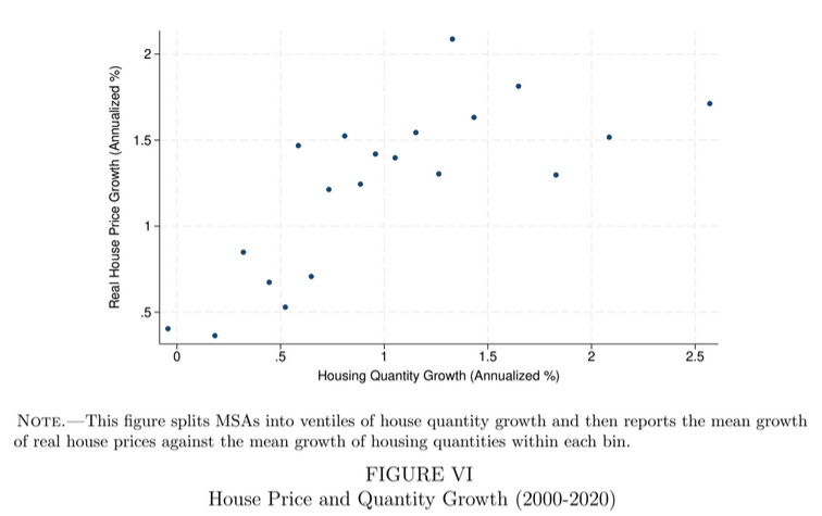
This analysis by LMW tells us that supply constraints do not appear to explain the price and quantity differences in housing across cities. Alternatively, although less plausible, the four different measures designed by economists to capture supply constraints, do not actually reflect supply constraints.
So What Explains Differences in House Prices/Quantities?
LMW argue that one of the major explanations of the observed house price differences is income growth in cities. In the charts below, LMW show the relationship between total income growth in a city (annualized percent change after inflation), and house price change (after inflation). In blue are “difficult” to build cities, while in red, “easy” to build cities.
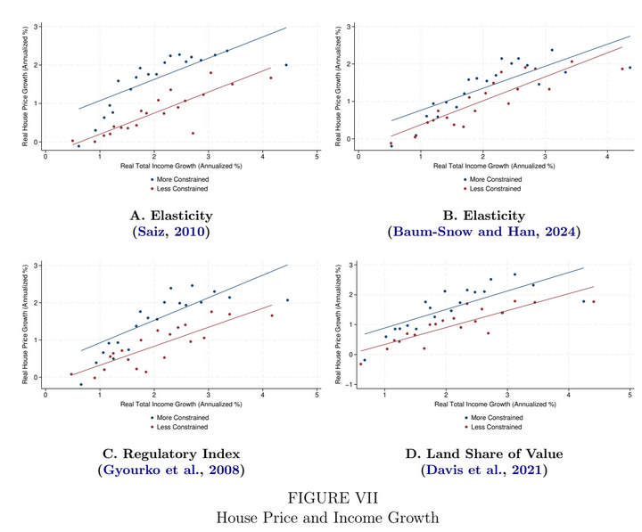
The house price growth relationship is basically identical, regardless of the difficulty in building. LMW illustrate this result with the following example – from 2020 to 2022, house prices in San Francisco grew by 2.4% annually (after inflation) compared to 1% for Houston. This put San Francisco in the 90th percentile of house price growth, while Houston was around the median. At the same time, per capita income in San Francisco grew by 2.2% annually (99th percentile of the US!) while in Houston it was 0.83% annually (10th percentile). In both cases, ‘affordability’ got worse by approximately the same amount.1
This suggests that supply constraints do not really impact ‘affordability’ and it feels like ‘affordability’ appears to be constant – that is, how much one spends on housing is closely related to income.
Housing Affordability – City Data
To see this pattern in the US, let’s look at ‘affordability’ in different US cities. First, it’s worth noting that ‘affordability’ should not only include housing costs, but also transportation costs. If we look at affordability measured as a percent of income spent on housing and transportation, affordability appears to be quite similar across cities:
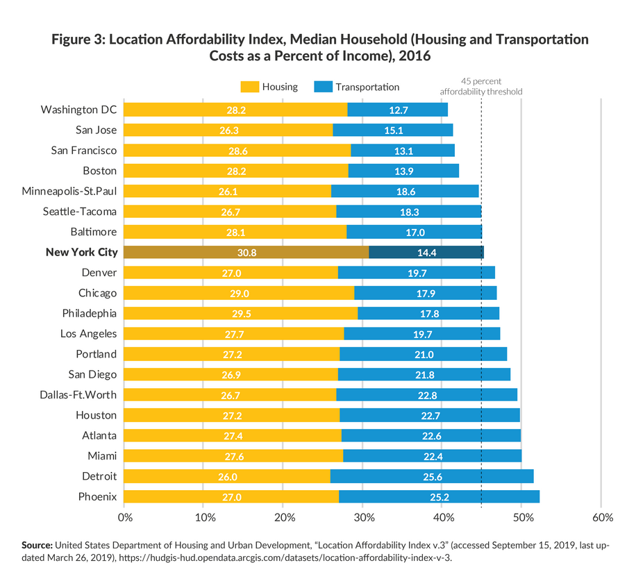
Moreover, the list of cities that are more affordable may come as a surprise to readers aware of the US housing market. The cities listed as most affordable on this list are often the ones considered to be the most supply constrained. The LMW paper can partially help explain why, as regardless of the supply constraints, these cities have similar affordability to other less supply constrained cities (if not actually more affordable).
So What To Make of All This
The LMW paper caused quite a stir in the economics profession and was immediately heavily criticized for making mistakes. Two counter commentary papers were written quickly after publication – Wiebe (2025) and Furth (2025). LMW responded to both criticisms (here and here) and addressed their concerns effectively. Moreover, LMW did something completely new to me, and issued an FAQ (Dropbox) addressing concerns and explaining their results!
Overall, it appears to me that the typical supply constraints like zoning regulations do not appear to influence affordability much. At Nominal News, we’ve previously discussed a simple outline of a housing model, which argued that deregulation is unlikely to change housing affordability, as demand for houses should be strongly linked to local income, as LMW showed in a much more formal way.
Moreover, I believe that not only does current local income matter for house prices, but also how much people expect income to grow in a city. If you believe wages in a particular city are expected to significantly increase, you’d be willing to pay more for a house today in order to have access to this job market.
It is worth noting that, regardless of the lack of impact on affordability from reducing housing supply constraints, building more homes would still be beneficial. In part, this is because cities may have an ‘agglomeration’ effect, i.e. there may be additional economic benefits just from the fact that people concentrate in a specific geographic area. The agglomeration effect leads to higher productivity (doing more with fewer resources), which pushes incomes higher (which in turn pushes house prices up).
My one key takeaway for anyone interested in housing policy is that there is no easy fix that can make housing more affordable (spending a lower share of one’s income on housing+transport). Suggesting that certain policy changes in certain cities result in large affordability increases is reckless economics.
Some economists have pointed out that since the blue line is above the red line, this shift could be explained by supply constraints, since it suggests that house price growth is higher on average in supply constrained cities. However, LMW looked into this and noted that the evidence suggests that this difference is explained by quality differences in housing, which are difficult to capture in a standardized index.
On a different topic, it is interesting to note that cities with greater affordability (those at the top of the chart) show a much lower share of income going to transportation. Not coincidentally, those cities also have the most effective public transit systems. The lower transportation costs seem to offset higher housing costs in some cases (NYC), but most cases seem to indicate that lower transportation costs are associated with higher incomes relative to housing. There is likely something in there we can work with.
One topic I have yet to see discussed is that “the high cost of housing” and “protecting property values” are two sides of the same coin. ANY measure to reduce the actual cost of housing will cause current homeowners to eat a loss, perhaps unrealized, perhaps not. Any solution that actually works, but doesn’t solve both sides of that coin is doomed to fail. There are lots of ideas, and many will have an effect, and most are required simultaneously, but none of them address the loss in wealth implied by good results. Any ideas?